
Packaging
A precision-driven approach focused on geometry and harmony.
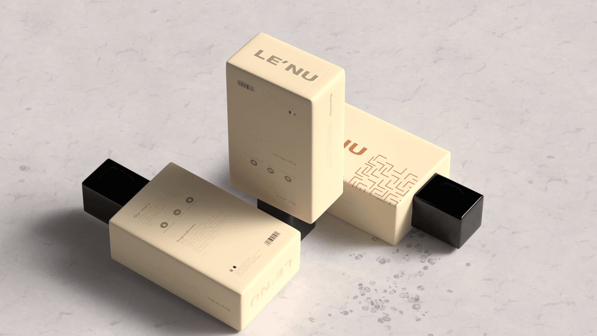
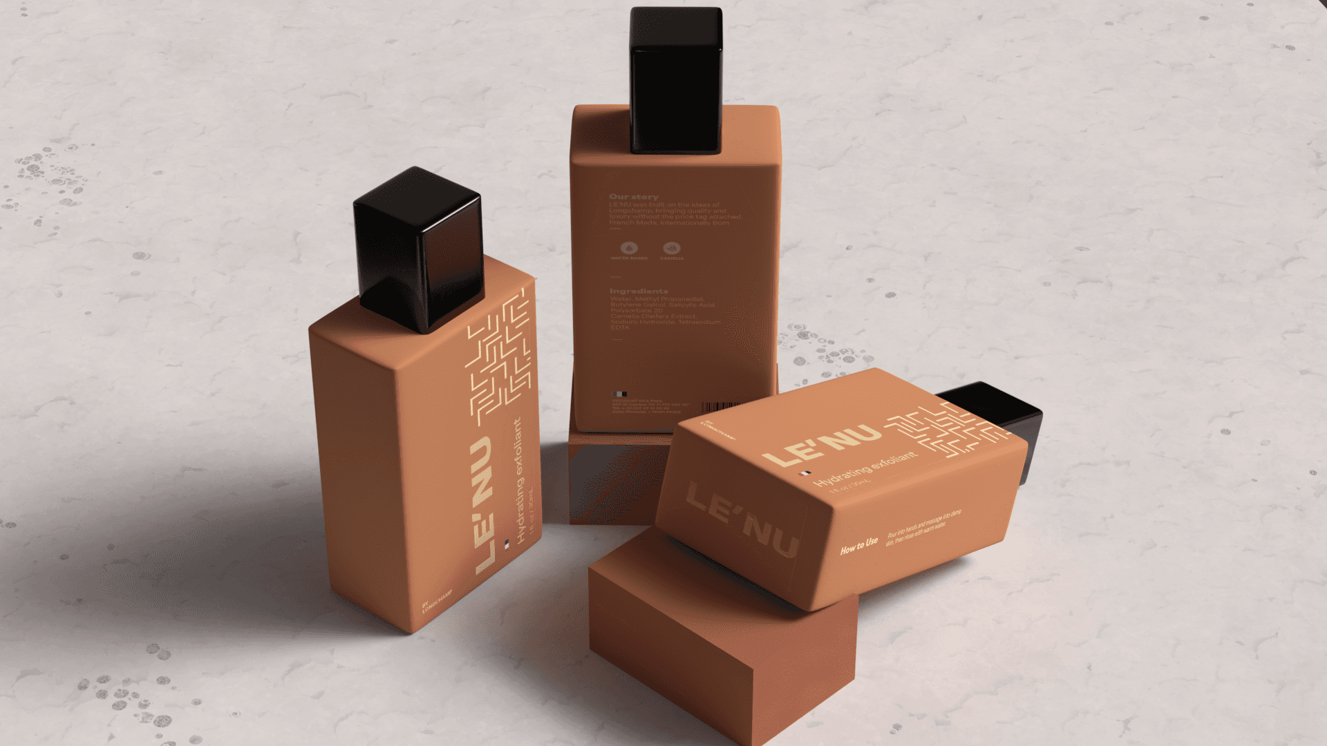
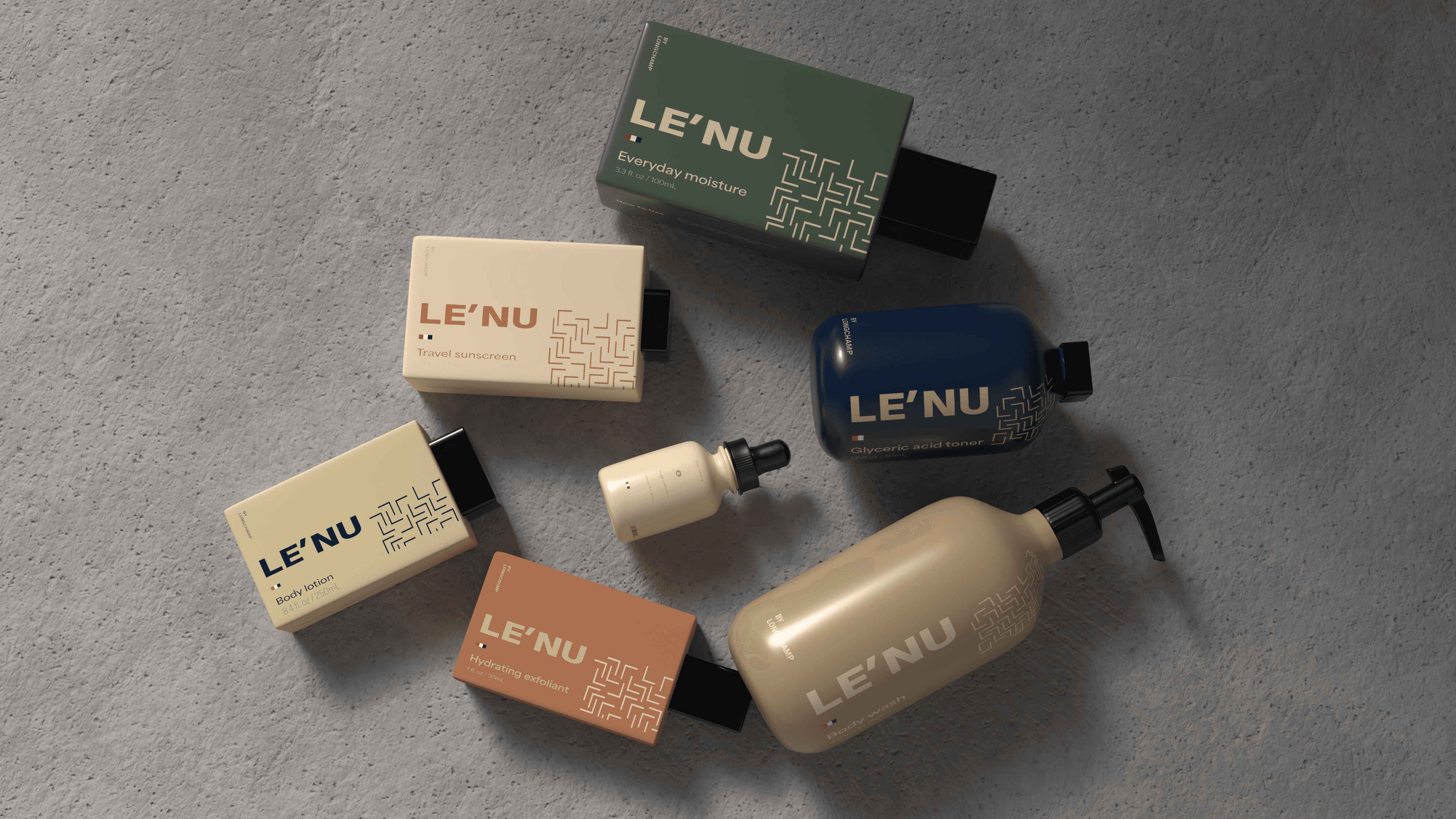
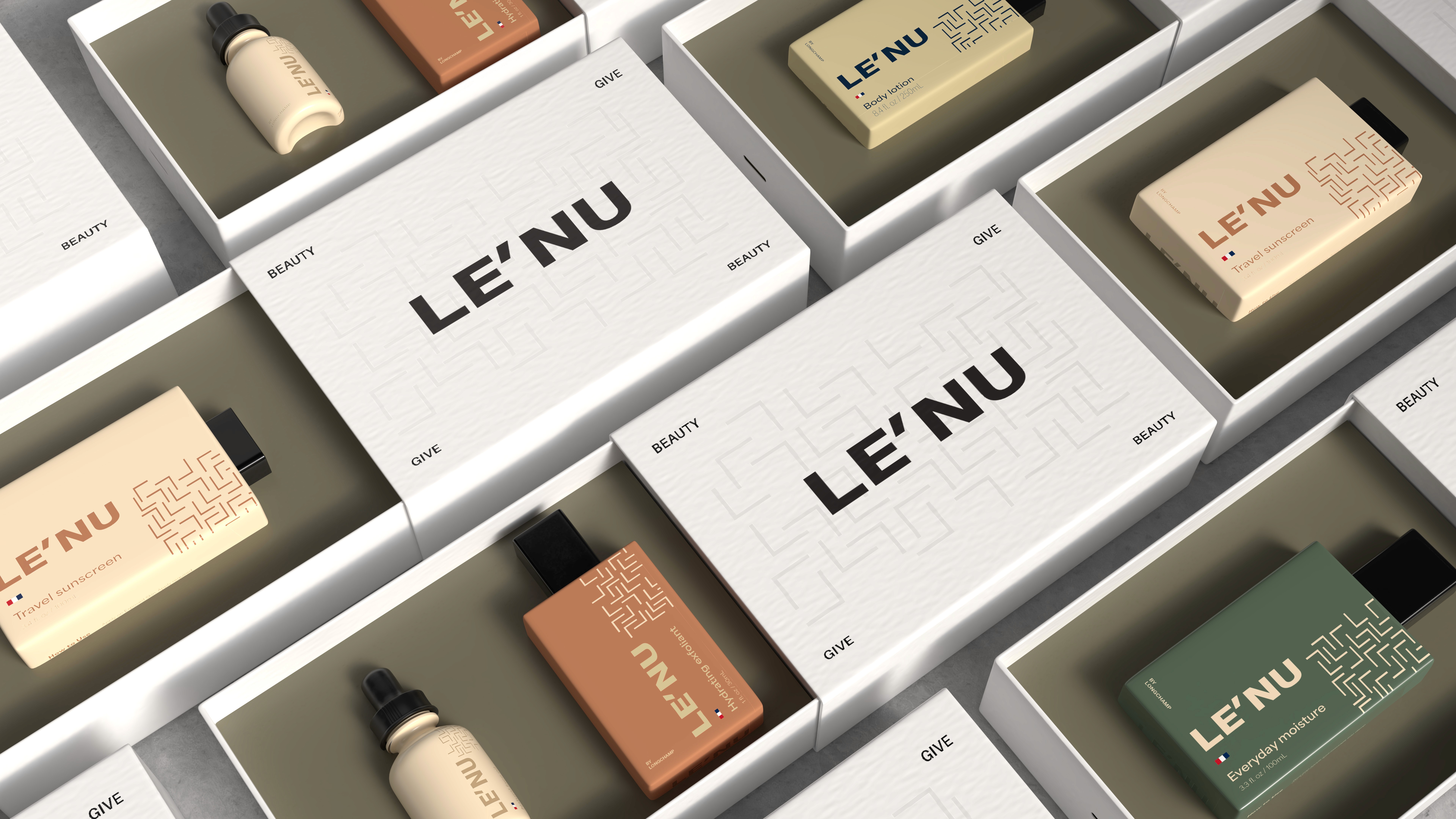
LE’NU follows its family companies roots in affordable yet classy products to reinvigorate modern skincare and how it shouldn’t be expensive, to simply feel good.
The Challenge
This project required creating a skincare line within a pre-existing brand while still developing its own unique identity. This involved the creation of packaging concepts, stands, and a full visual system that fell in line with the existing brand's goal to be fresh and young.
The Approach
To approach the project, I analyzed packaging requirements such as sizings and ingredients for each product. I then modified existing 3D models to match the shape language of the brand, allowing room for experimentation with form and structure. This process led to a visual identity that balanced youthful energy with clarity and modernism.